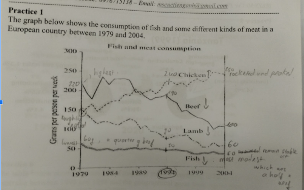
The line graph provided presents the intake of fish and types of meat
to that the amount of chicken consumed experienced an upward trend, whereas that of 3 remaining declined.
In 1979, the amount of beef was highest, at 220 grams, while the figure of chicken and lamb was roughly equal at 150 grams, accounting for four folds of fish, noted at 60 grams. After 15 years, the chicken consumption rocketed to 240 grams, opposed to beef which declined
At the of the timeline, the intake of chicken rose
This words can be replaced with:a number of
somenamely
beef, lamb, and chicken in a nation of Europe from 1979 to 2004.Overall
, it is This words (depending on the context) can be potentially replaced with :apparent
clearThis words (depending on the context) can be potentially replaced with :witness
seeIn addition
, the figure of fish was the most modest among the 4 kinds mentioned.In 1979, the amount of beef was highest, at 220 grams, while the figure of chicken and lamb was roughly equal at 150 grams, accounting for four folds of fish, noted at 60 grams. After 15 years, the chicken consumption rocketed to 240 grams, opposed to beef which declined
slightly
to 190 grams, while the figure of lamb decreased stable to 90 grams. And, the quantity of fish declined insignificantly
to 50 grams.At the
This words (depending on the context) can be potentially replaced with :expiration
endslightly
and peaked at 250 grams, whereas beef consumed dropped remarkably
to 100 grams, while the figure of lamb declined to 60 grams. And, fish consumption remained stable at 50 grams, making up a half of beef
6
Total Band
5.5
Coherence and Cohesion
6
Lexical Resource
6
Grammatical Range
6.5
Task Achievement