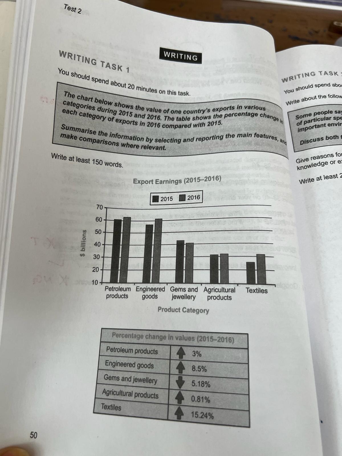
The bar chart illustrates the exports of a country in categories in 2015 and 2016. The table gives information about the percentage changing in 2016 comparing with 2015. in both years. Petroleum income was about 61 billion dollars in 2015 and it experienced 3 percent increase and accounted for almost 63 billion in 2016. Approximately 57 billion in 2015. When it to 2016, it became about 62 billion with 8. 5 percent difference. Gems and sector contributed the country's economy almost 43 billion dollars this number value accounted almost 31 billion then, it made up approximately 32 billion with a 0. 81 percent increasing. Most value sector which is textiles experienced 15. 24 percent increase and it became almost 32 billion dollars in 2016.
This words can be replaced with:various
differentApostrophe might be missing. Did you mean "values'" or "value's"?values'value's
valuesOverall
, most money is earned
from petroleum products and engineered This words (depending on the context) can be potentially replaced with :productscommoditiesmerchandises
goodsDid you mean "product's" or "products'"?product'sproducts'
products'sis earned
from engineered This words (depending on the context) can be potentially replaced with :productscommoditiesmerchandises
goodsThis words (depending on the context) can be potentially replaced with :approachesarrives
comesUse "an" instead of 'a' if the following word starts with a vowel sound, e.g. 'an article', 'an hour'an
aPossible spelling mistake. 'jewellery' is British English.jewelry
jewelleryThis words can be replaced with:on the contrary
butis decreased
by 5. 18 percent in 2016. Agricultural Did you mean "product's" or "products'"?product'sproducts'
products'sThis words (depending on the context) can be potentially replaced with :modifiedaltered
changed5.5
Total Band
5
Coherence and Cohesion
5
Lexical Resource
6.5
Grammatical Range
5.5
Task Achievement