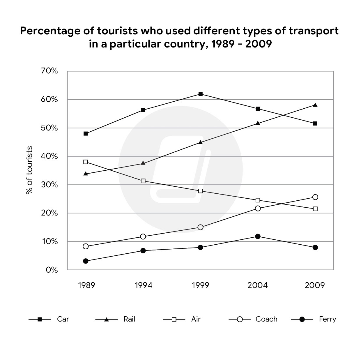
The line chart illustrates information for how were used various kinds of vehicle within particular nation from 1989 to 2009 There was an increase in the proportion of transports were car, rail, coach and ferry while a decline was in the air. transport in car at about 48%, after which it progressive increase to exactly 51% in 2009. Similar trends were in the figures for rail and coach rose from 34% in 1989 to 58% in 2009 and increased over 8% in 1989 to roughly 28% in 2009, to roughly 5% fluctuation subsequent and final increased quite with estimate 10%. under 38% in 1989 to a final dropped roughly 20% in 2009
Use "many" with countable nouns.many
muchPossible spelling mistake found.travelers
travellersThis words (depending on the context) can be potentially replaced with :witnessed
seenIn addition
, car generally
had the highest figures in 19-99 by diagram The amount of tourists used This words can be replaced with:various
differentThis words (depending on the context) can be potentially replaced with :embarked on the proccess of
startedThis words (depending on the context) can be potentially replaced with :witnessed
sawThis words (depending on the context) can be potentially replaced with :witnessed
seenThis words (depending on the context) can be potentially replaced with :apparent
clearThis words can be replaced with:merely
justrespectively
Approximately 5% of the transports various were used in ferry, This words (depending on the context) can be potentially replaced with :initiatecommence
beginConversely
, the figures for airway from This words can be replaced with:merely
just6
Total Band
5.5
Coherence and Cohesion
5.5
Lexical Resource
6.5
Grammatical Range
6
Task Achievement